Weather Chart 2012
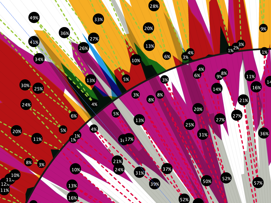
This printed poster visualizes the people’s sentiment in relationship to the weather. Doing so by analyzing a huge amount of social media posts. This resulted in some interesting findings.

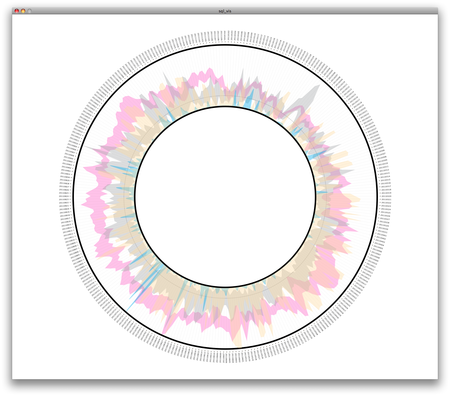


Sandbox

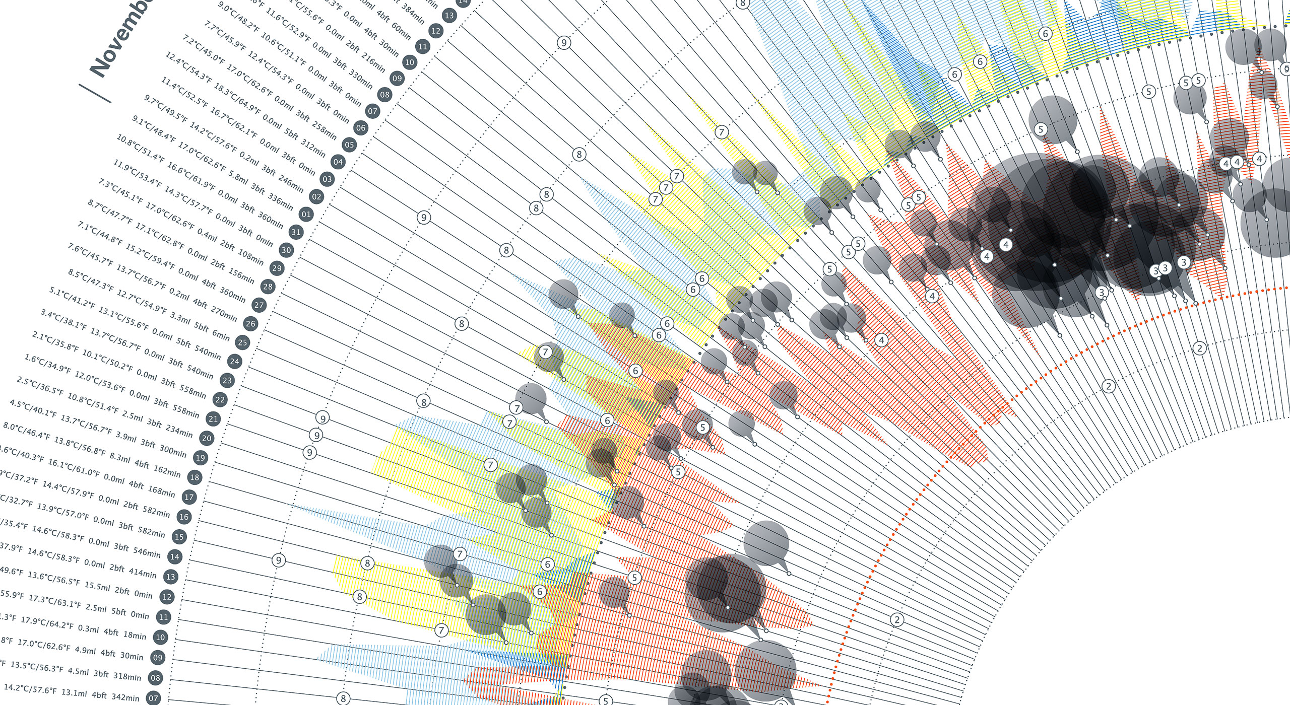
This printed poster visualizes the people’s sentiment in relationship to the weather. Doing so by analyzing a huge amount of social media posts. This resulted in some interesting findings.